
Adapting a Mobile Push-Notification Guided Relationship Program for the Web
Kinnect • Nudge
Background
In our weekly team meeting, we noticed relationships drift quietly when life gets busy.
Someone hadn't replied to a close friend for weeks. My sister hadn't called me back in days. Not because we don't care. Life just gets busy. We started asking: how can we gently remind people to care for relationships that matter, without guilt? The challenge was creating nudges that feel supportive, not transactional.
Kinnect
Client/Company:
Experience & Product design/research
Role & team:
v 1.0
Versions:
Sept 2025 - Dec 2025, 4 months
Timeline:
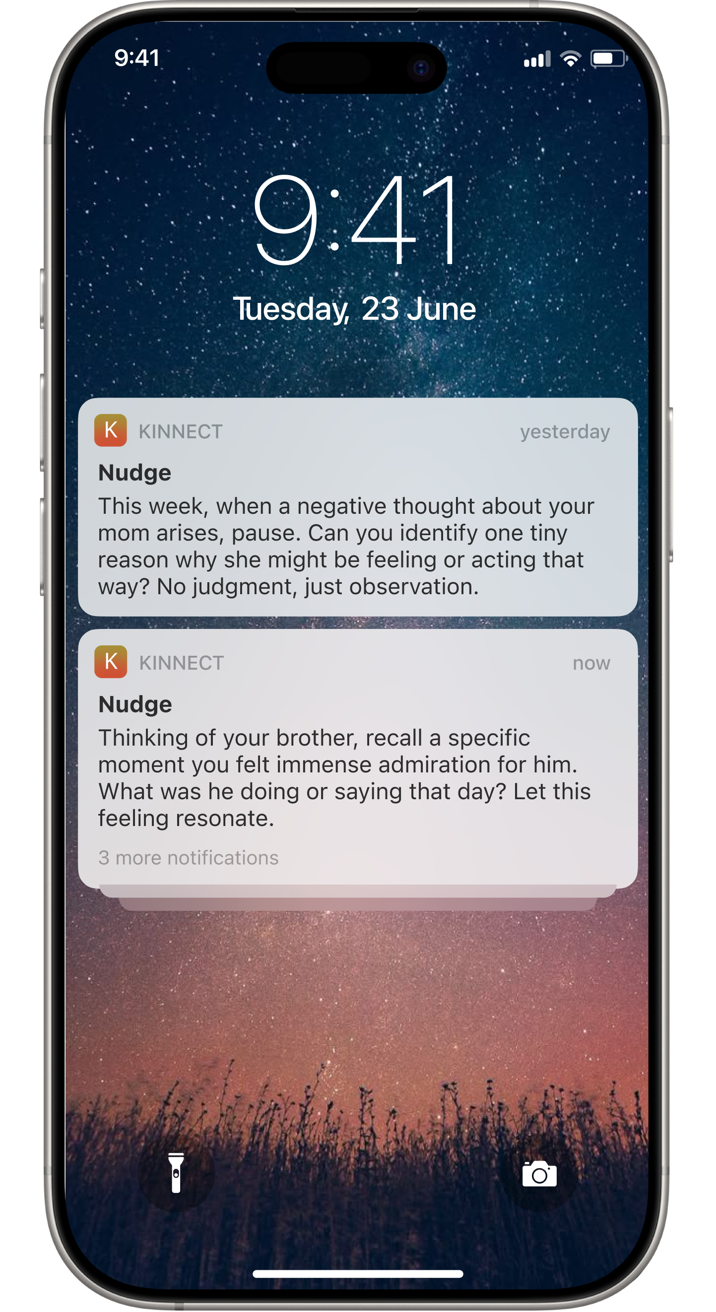
There was nowhere meaningful to go after opening them. Longer nudges got cut off on mobile. The emotional intent got lost really quickly. We realized the format itself was the problem, not the content.
Push notifications didn't work the way we thought because people mostly just tapped, skimmed, and left.
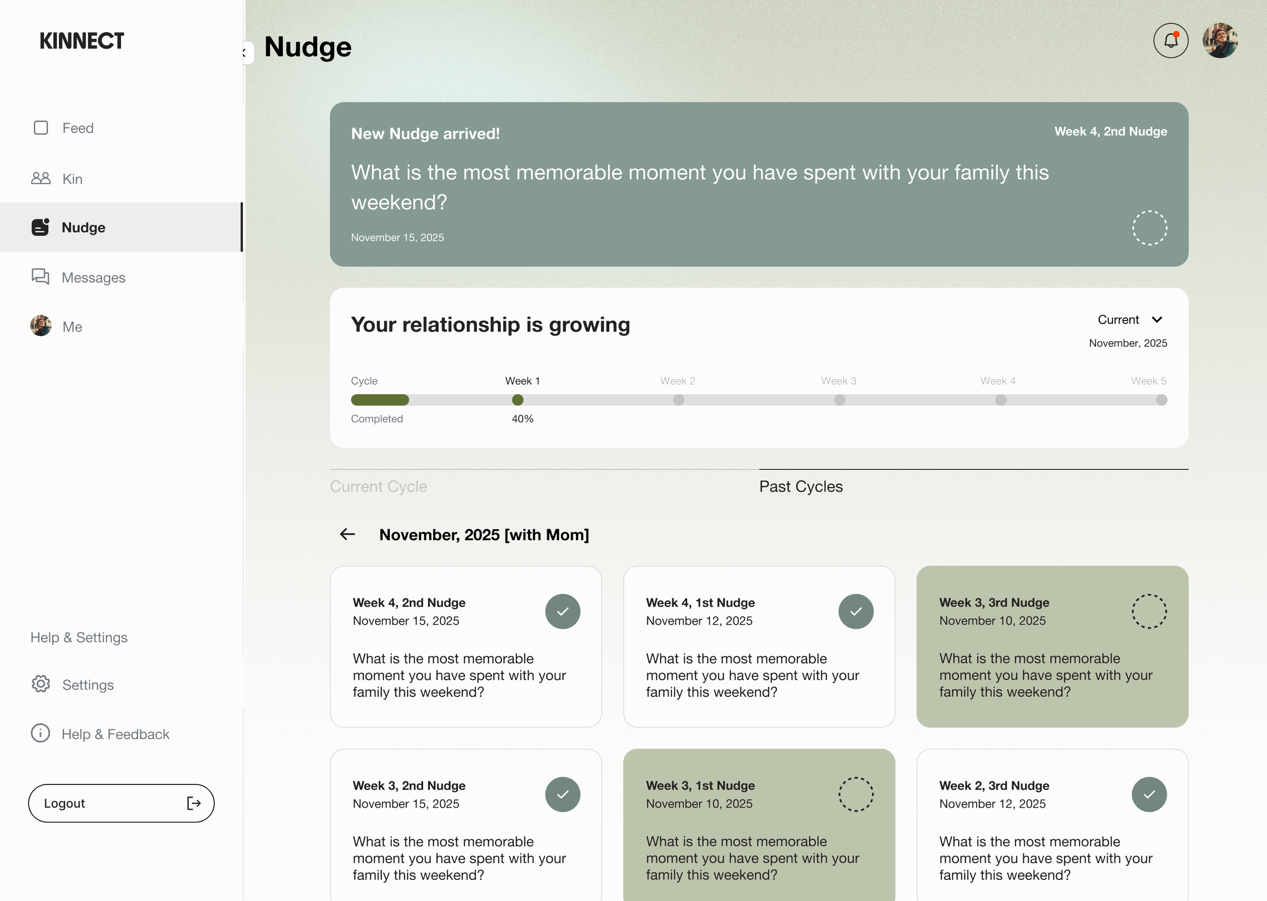
Approach: More frequent, like a habit tracker
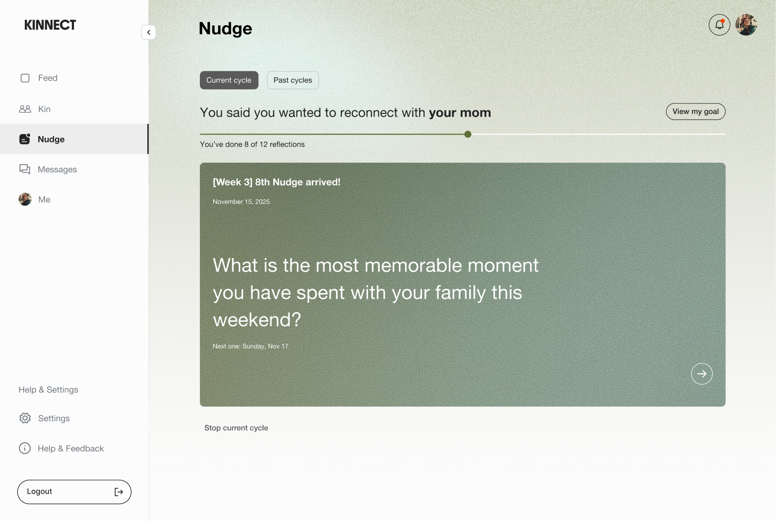
Set the exact cycle: Three nudges notifications per week, 30 days entire cycle.
Habit tracker: Once users check the Nudge notification, they can check it as a to-do list
Progress bar: Users can see the achievement of the Nudge cycle through percentage
It turned something emotional into transactional.
With the feature name 'Nudges' and the to-do-list format, users felt pressure. It wasn't offering space to solve the real problem, which is improving relationships. We had to rethink the entire approach.
Failed
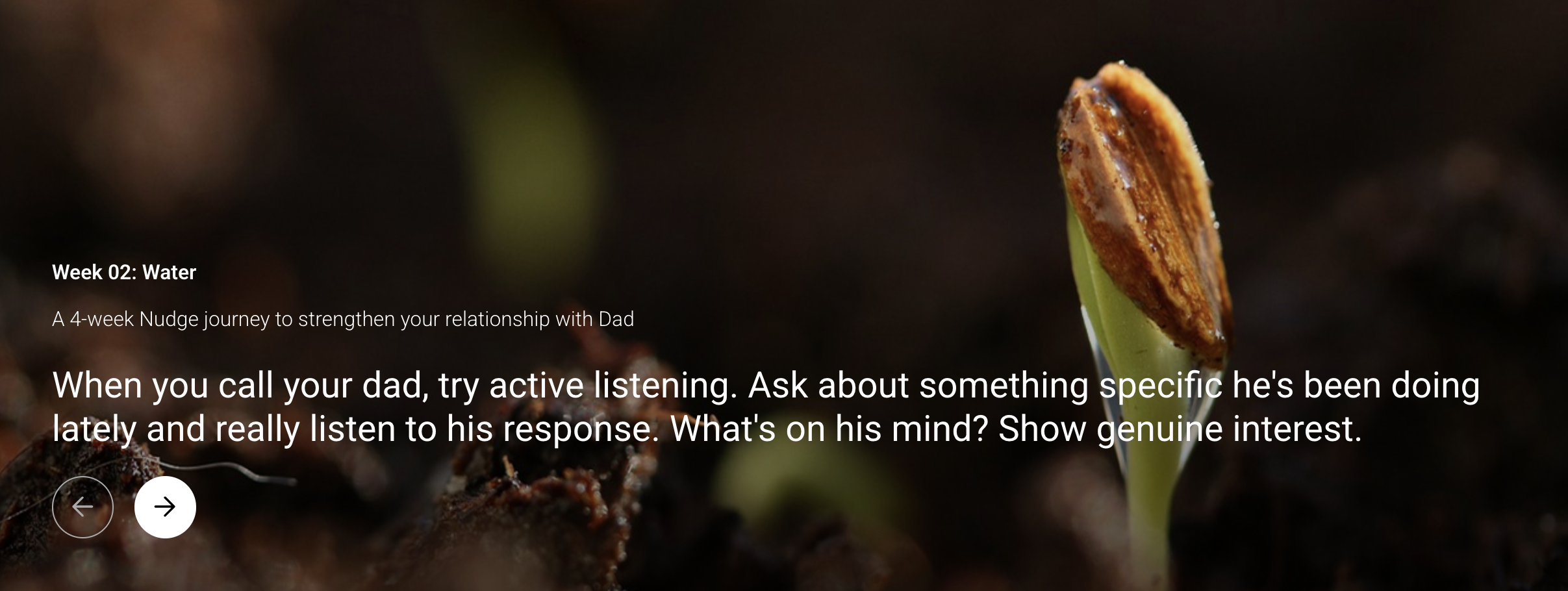
Week 1: Seed. -> Week 2: Water. -> Week 3: Care. -> Week 4: Grow.
Ok, step back. I approached the problem by redefining how we want users to achieve the goal through storytelling by using the concept of ‘planting your relationship’.
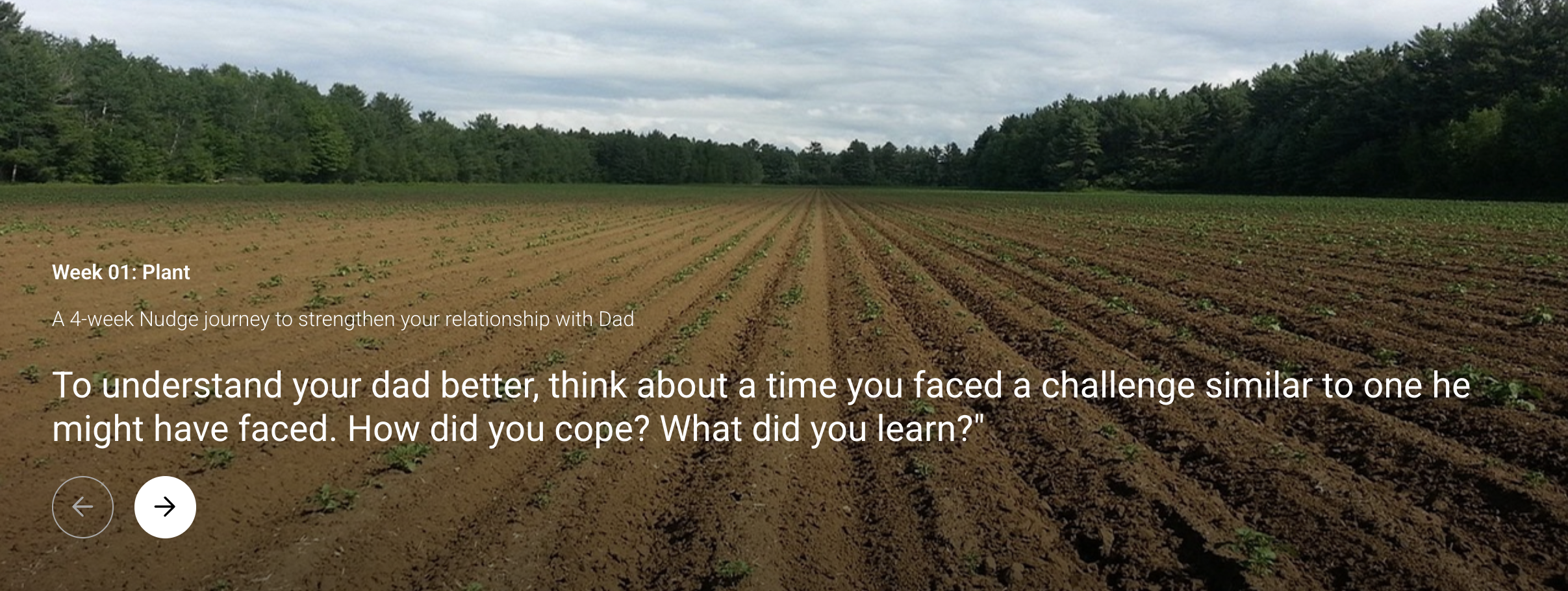
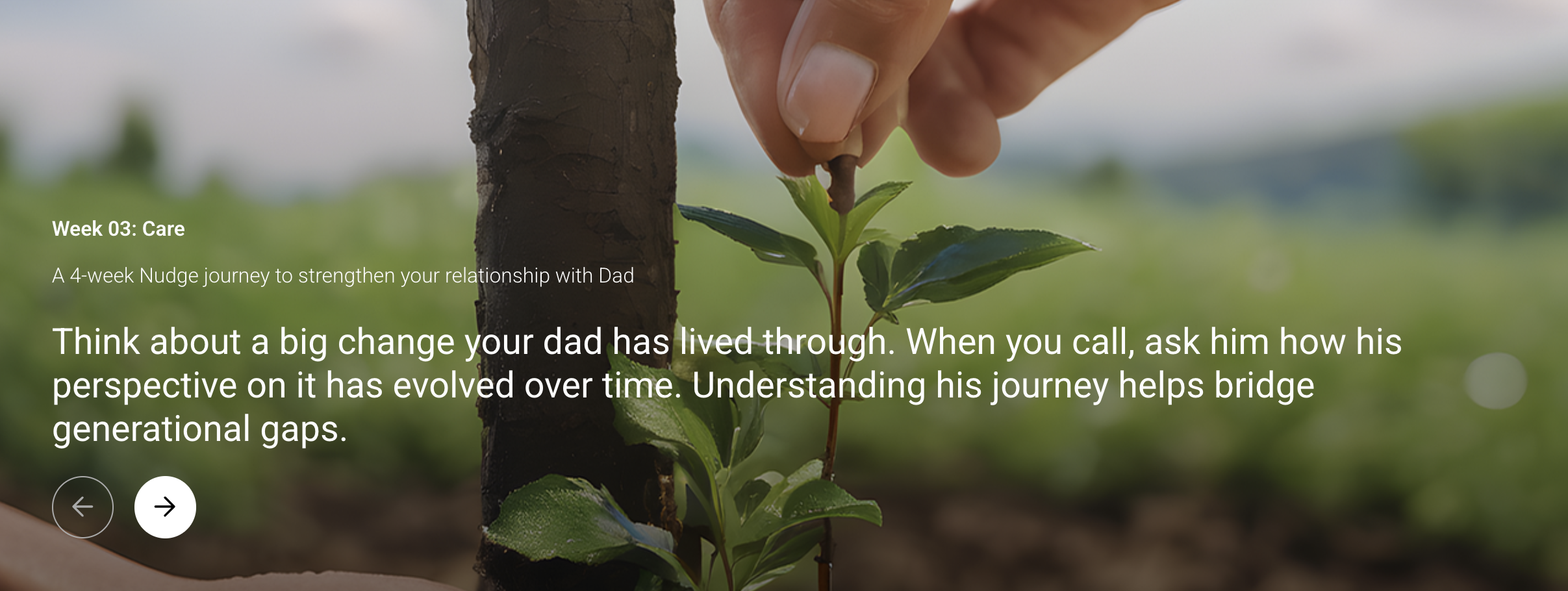
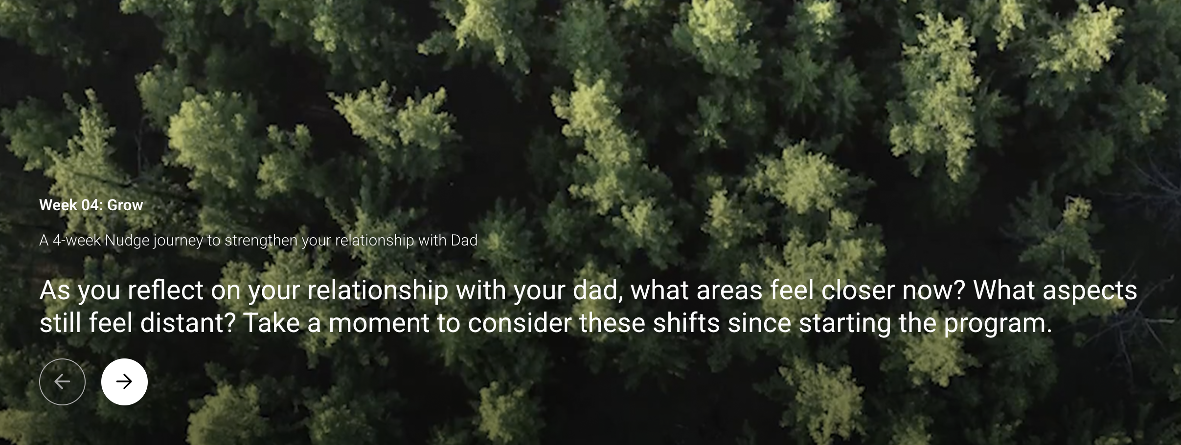
With the storytelling concept, we approached the Nudge feature to create a space where users can reflect to grow their relationships.
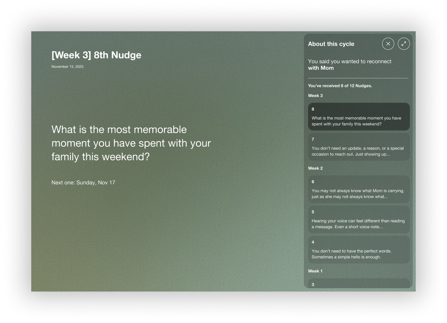
Instead of a to-do-list, we used a weekly check-in model with AI.
After every three Nudge notifications, users reflect on how they were doing, what worked or not. This helps users process their week while AI generates personalized prompts for the next week based on their answers.
To grow relationships, we realized the design should feel meditational, not goal-oriented.
We kept the progress bar minimal.
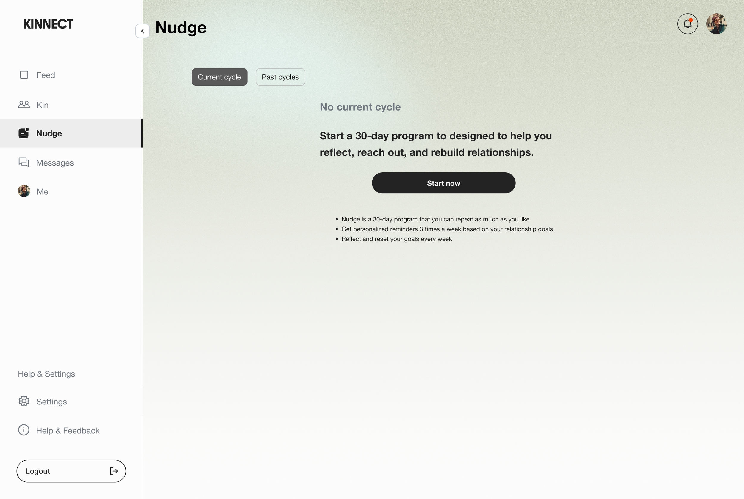
Users understood what the feature did, but they didn't feel emotionally ready to start.
A button felt too functional for something about relationships.
So we intentionally designed the empty state feel less like a button press by using the onboarding’s first question to type directly to start the Nudge program.
Before
Intuitive entry point gets users to start immediately

Bold CTA can help users to start directly.
Lack of emotional connection

Users understood the feature's purpose, but a 'Start now' button didn't capture the feature's personality.
After
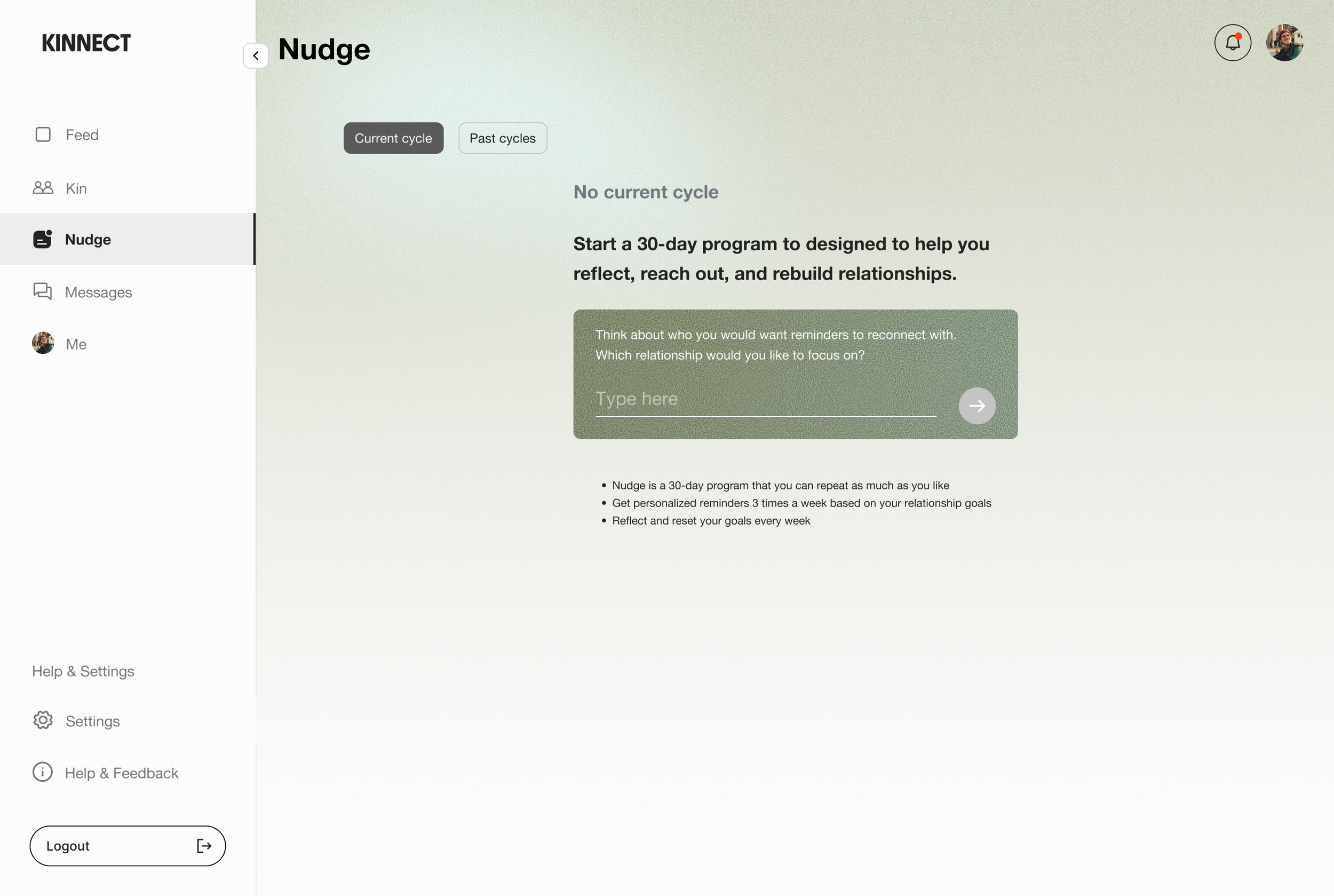
Remove the barrier between understanding and starting
Users can type the onboarding question directly in the empty state.
Make the first step feel like a conversation, not a commitment

It lowers the barrier to start and matches the feature's emotional tone from the first interaction.
Takeaway:
Emotional design requires different patterns than productivity design. What works for task management doesn't work for relationships. The format shapes the meaning. Push notifications made nudges feel disposable, so creating a dedicated space changed how users engaged with the feature. Onboarding is about emotional readiness, rather than just understanding. Even though users knew what the feature did, they weren't ready to start. Pairing AI with weekly check-ins created a feedback loop where users felt heard and prompts became more personal over time. Sometimes, less UI is more supportive. Relationships don't have finish lines, so keeping the progress bar minimal shifts focus from achieving goals to being present.